Icons
Icons are specific graphics that guide the user with information. Zepp OS provides various icon elements to suit applications in different scenarios. This specification lists the usage scenarios, icon composition, graphic modeling, icon size, resource output, and other rules to guide the use of icon elements.
Design principles
Zepp OS icons follow the "lightweight" and "friendly" design concepts. Use simple geometric configurations in modeling, simplify redundant details, ensure recognizability, and convey meanings clearly. Avoid straight edges and sharp corners in details, and use curves that are curvature continuous to convey natural beauty.
Icon types
- App icons
- General feature icons
- Button icons
App icons
An application icon should clearly and transparently convey its feature /brand/service information, and the design style should follow Zepp OS system application icons. Provide resources in multiple sizes based on the requirements of this specification to ensure that the icons are suitable for mobile devices, mobile application stores, and other scenarios.
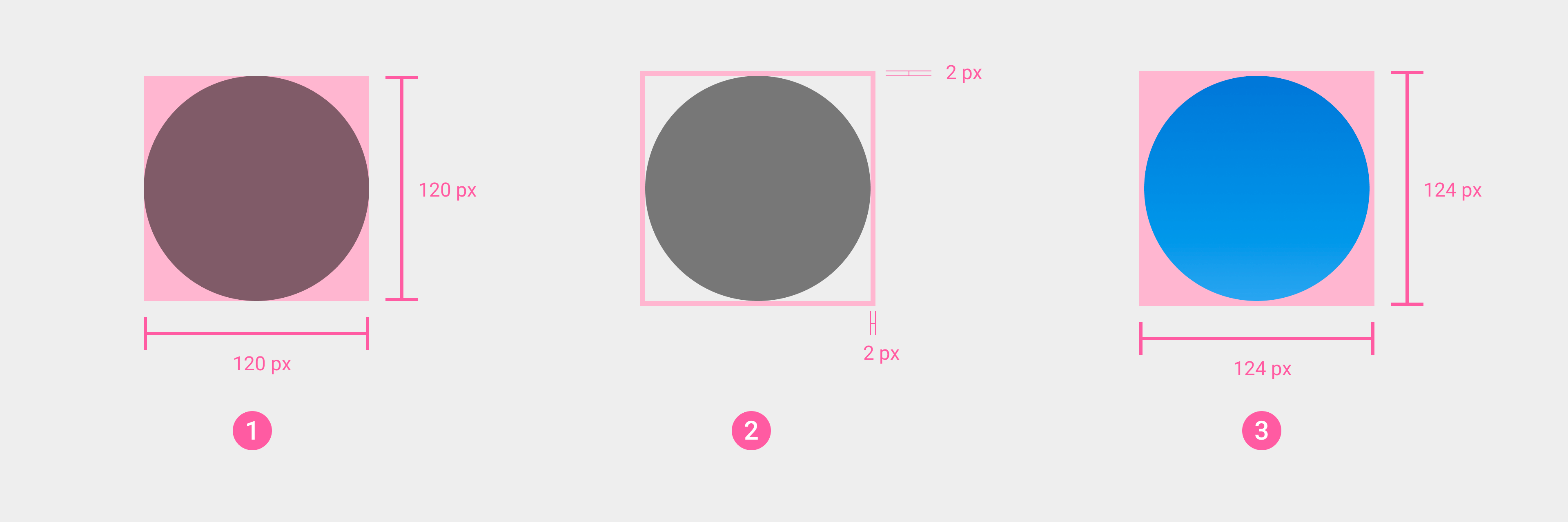
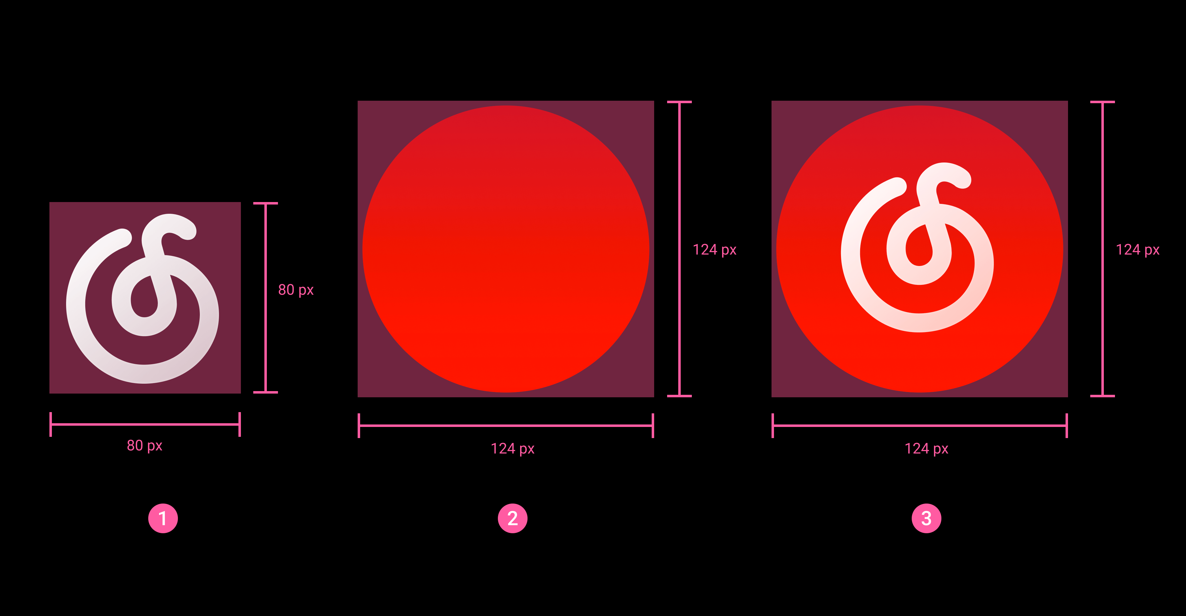
- The application icon as a whole should be round, with a size of 124*124px, and a blank and transparent safe area should be reserved inside (2px on the top, bottom, left, and right).
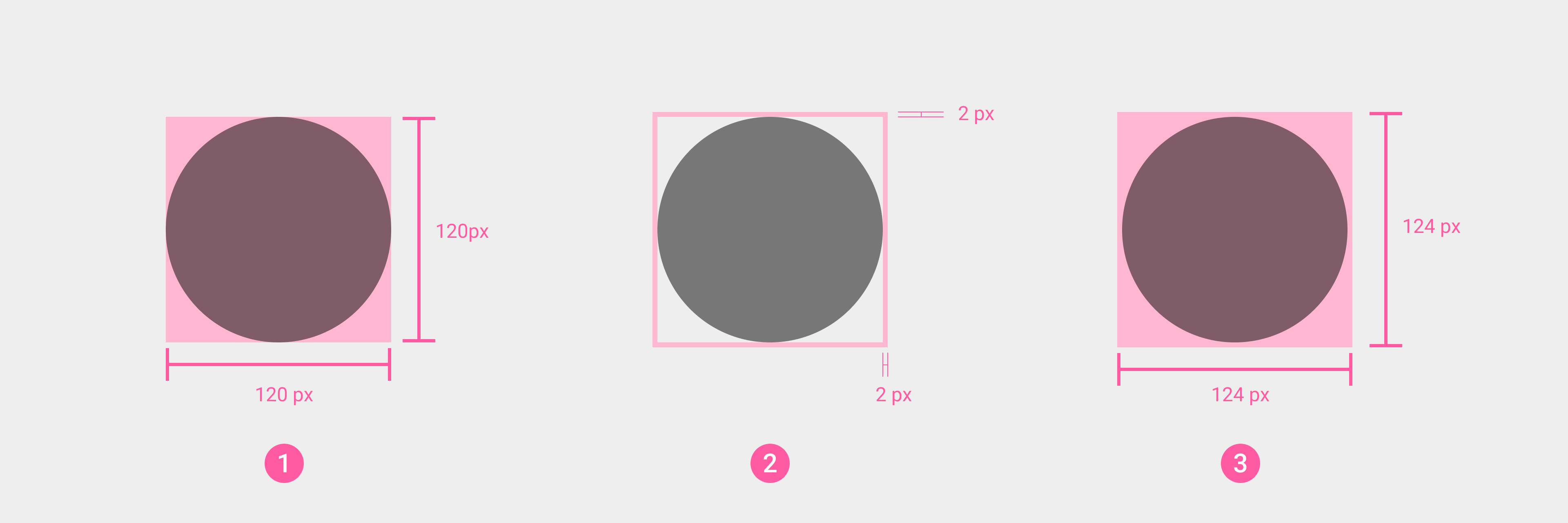
① App icon content size
② Transparent safe area
③ App icon final size
- The app icon consists of a main graphic and a background image.
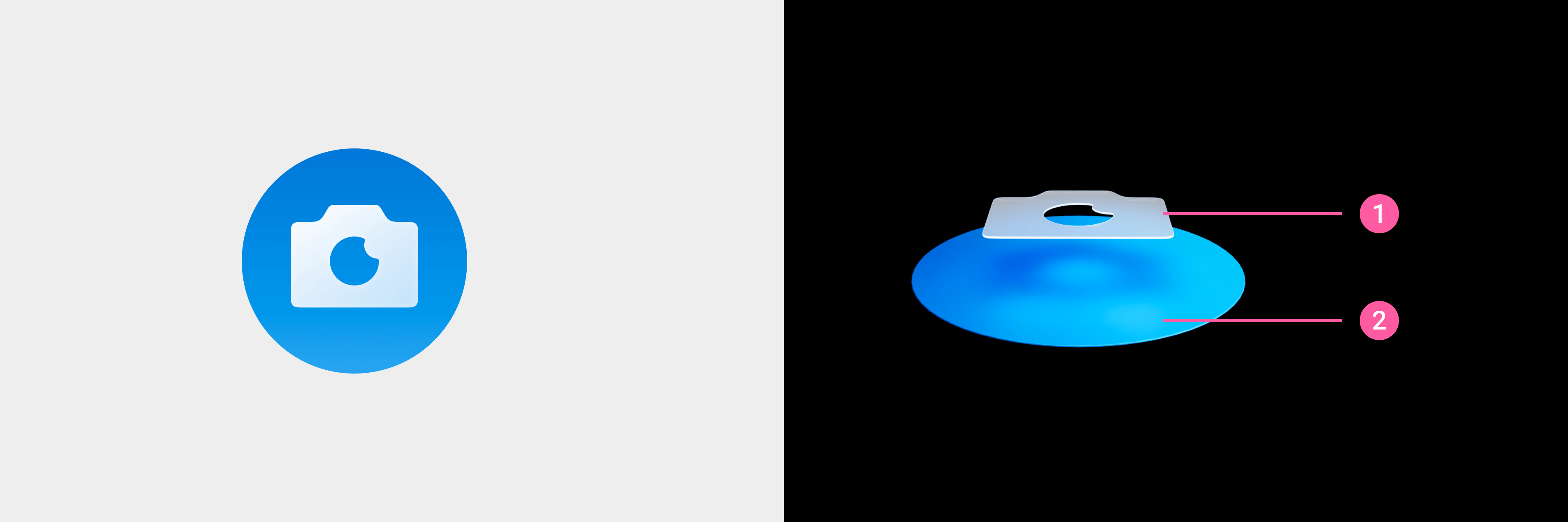
① Main graphic
② Background image
- ② The size of the app icon's main graphic is 80*80px, and generally the drawing area is kept at 70*70px. If the graphic needs additional visual weight to ensure consistency with other icons, the drawing area can be extended to the reserved area (note: in any case, the graphic should remain within the 80*80px range).
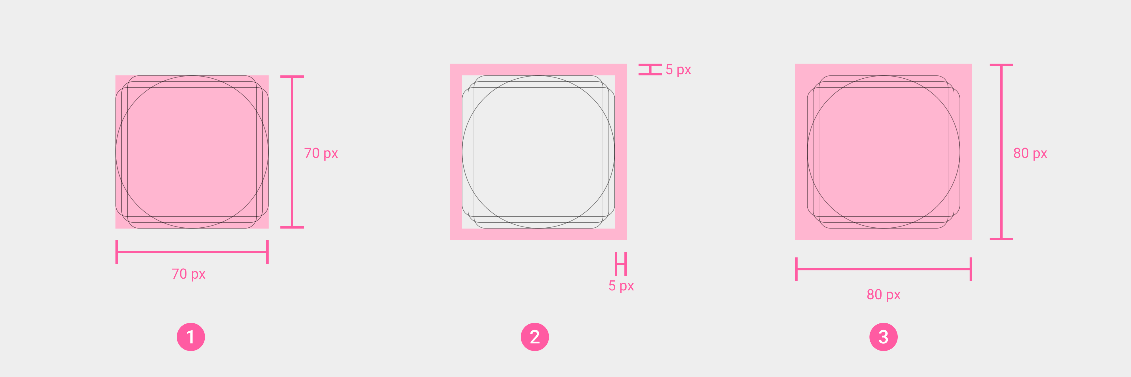
① Basic drawing area of the icon body
② Reserved area of the icon body
③ Actual size of the icon body
① The size of the icon body should not exceed 80*80px.
- The background image of the icon is circular, with a size of 124*124px, and a blank and transparent safe area should be reserved inside (2px on the top, bottom, left, and right).
① Size of the icon background image
② Transparent safe area
③ Example of the actual size of an icon background image
- Do not use non-circular background images.
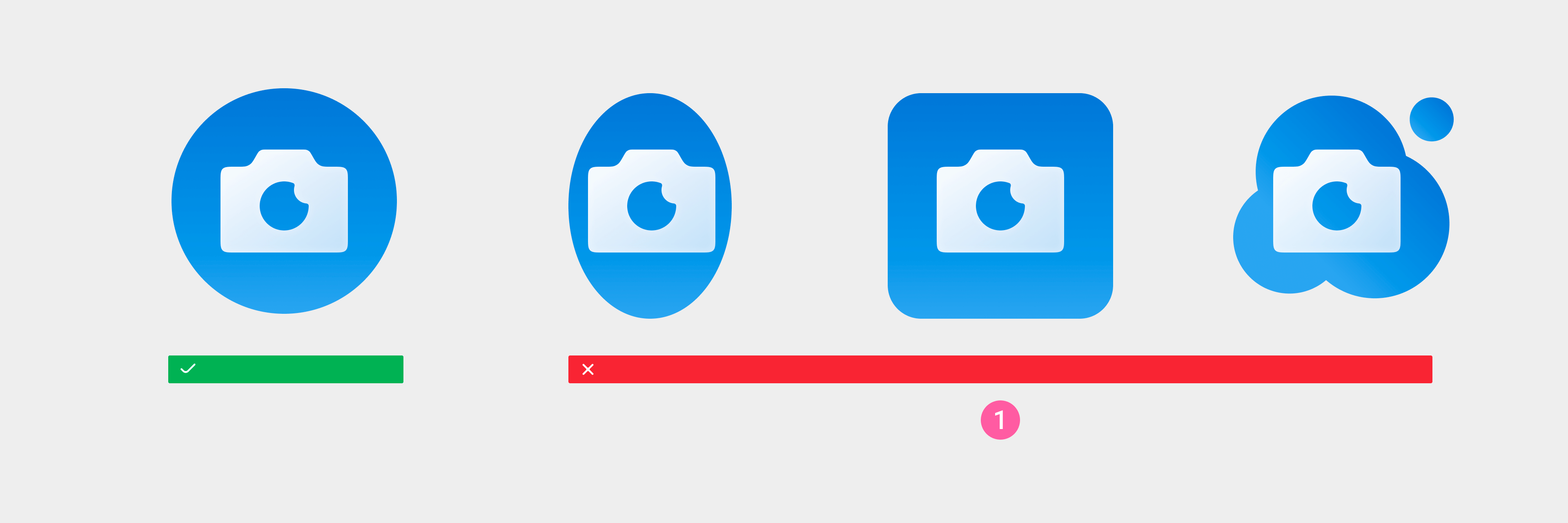
① Do not use non-circular background images.
- Avoid using a solid black background image, transparent areas, and transparency.
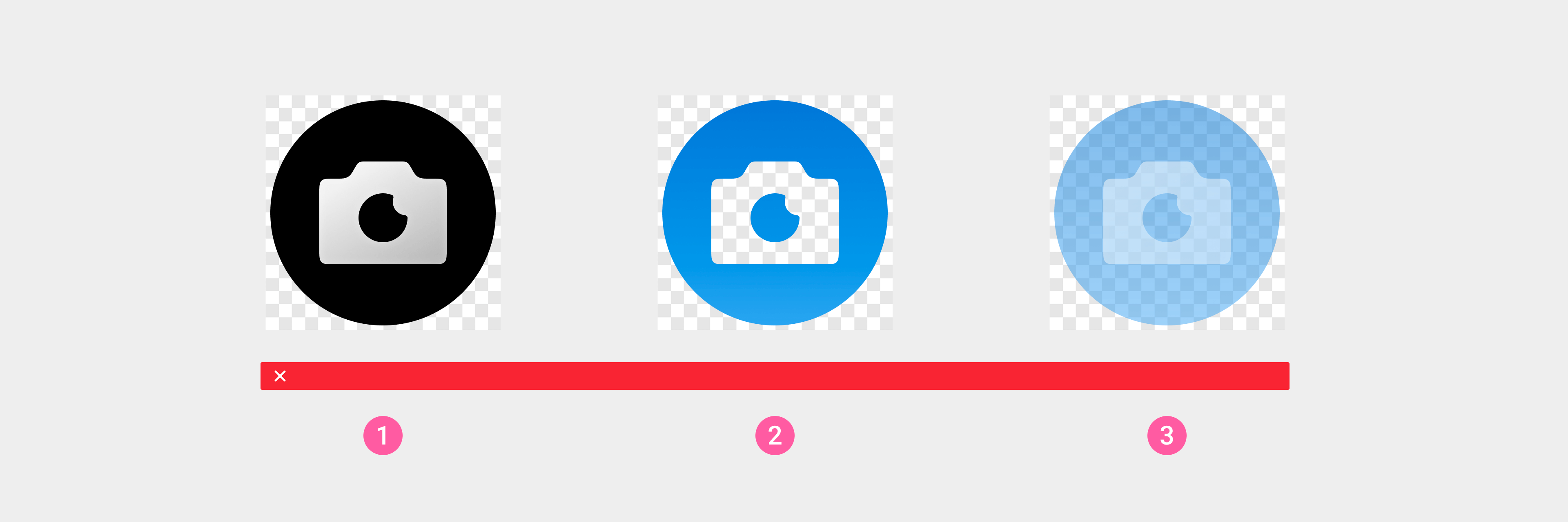
① Do not use a solid black background image.
② The background image should not contain transparent areas
③ Do not use transparency
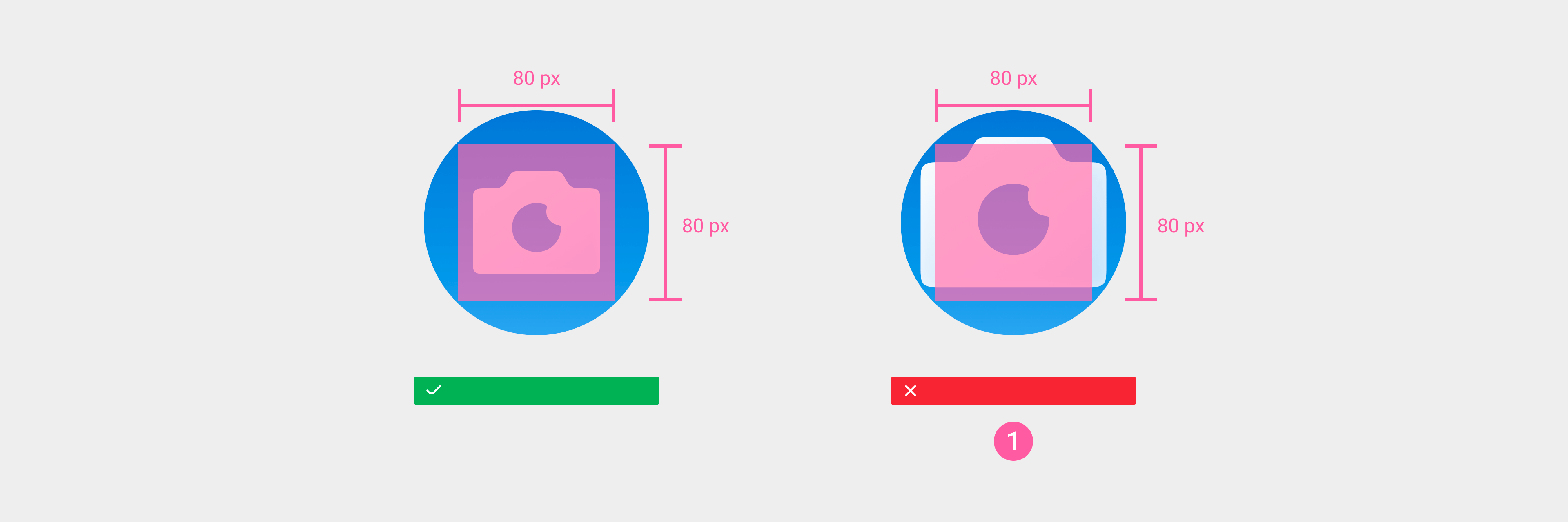
- The main graphic of an app list icon should not exceed the background image area.
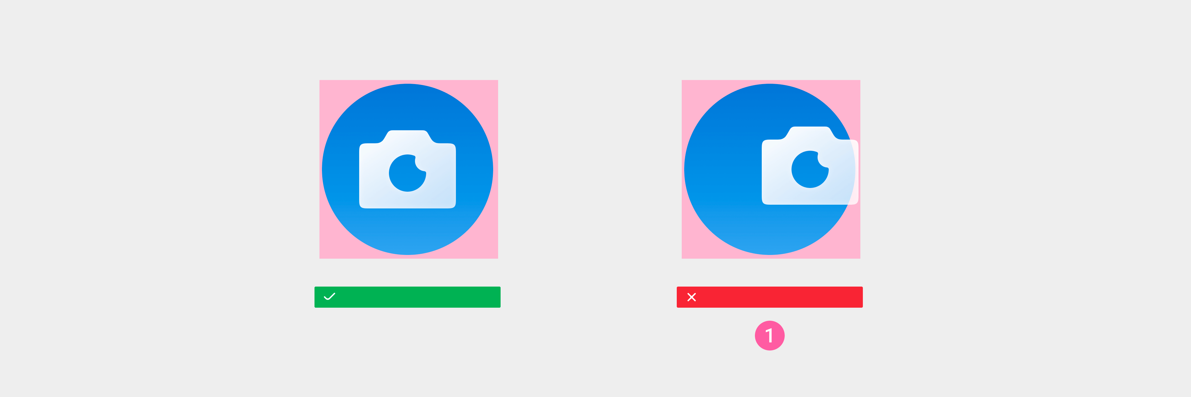
① The main graphic should not exceed the background image area.
- The icon resource should output an image in PNG format with a blank transparent safe area.
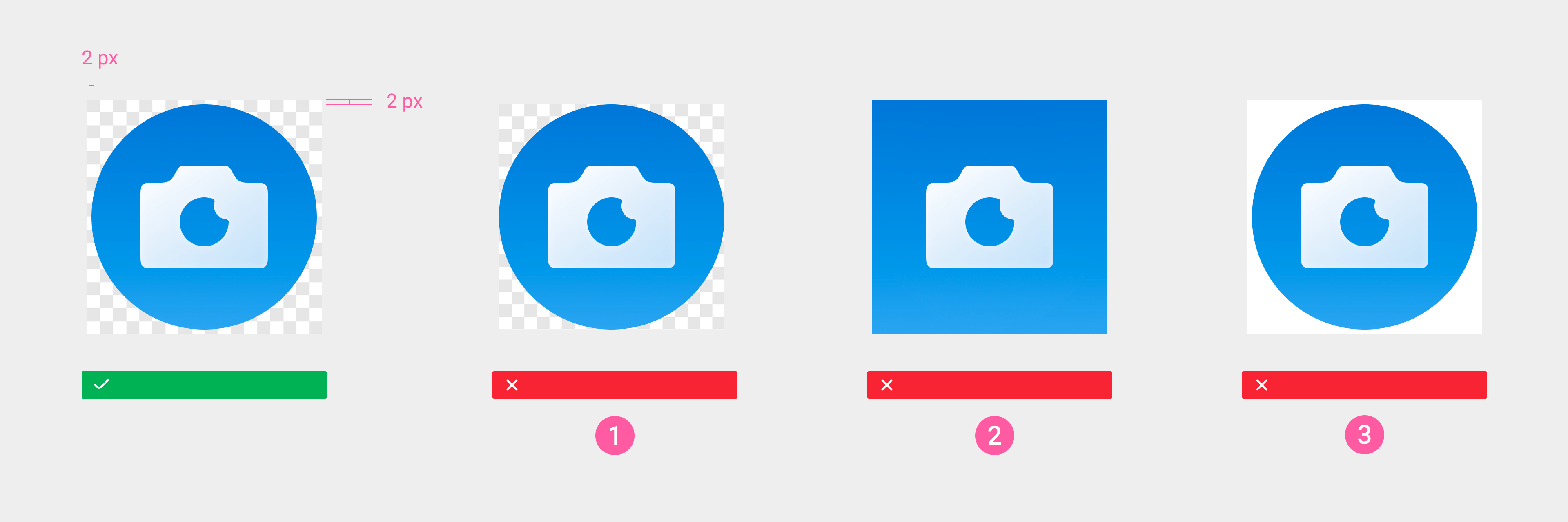
① The background image should be surrounded by a blank and transparent safe area (2px on the top, bottom, left, and right).
② The background image should be circular. Avoid using other shapes.
③ The non-icon area should be kept blank and transparent.
- Design example
① Icon main body graphic: 80*80px
② Icon background image: 124*124px, including the blank and transparent safe area around the image (2px on the top, bottom, left, and right)
③ Final application icon
- Actual use examples
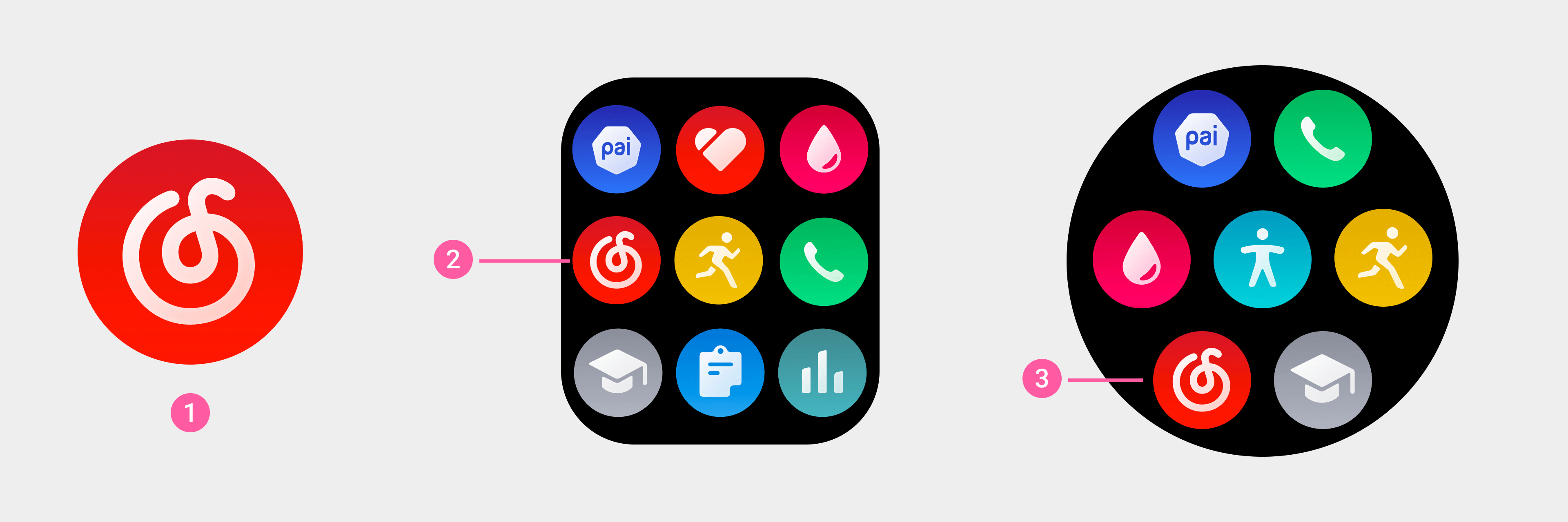
① "NetEase Cloud Music" app icon
② ③ "NetEase Cloud Music" app icon in the app list.
Icon resource output
- Size comparison:
| Device resolution | 480×480px | 466×466px | 454×454px | 390×450px |
|---|---|---|---|---|
| App icons | 124×124px | |||
| Store icons | 240×240px | |||
| Note: The icon needs to contain a blank and transparent safe area (2px on the top, bottom, left, and right). | ||||
- Format: a PNG image surrounded by a blank and transparent area.
General feature icons
Feature icons are mainly used to communicate system or feature information and indicate status information. Common feature icons support regular size, medium size, and ultra-small size.
Usage examples:
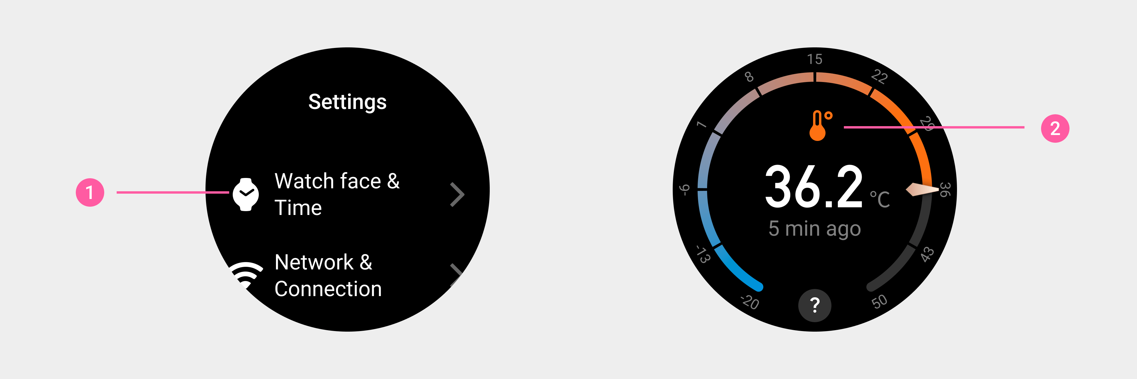
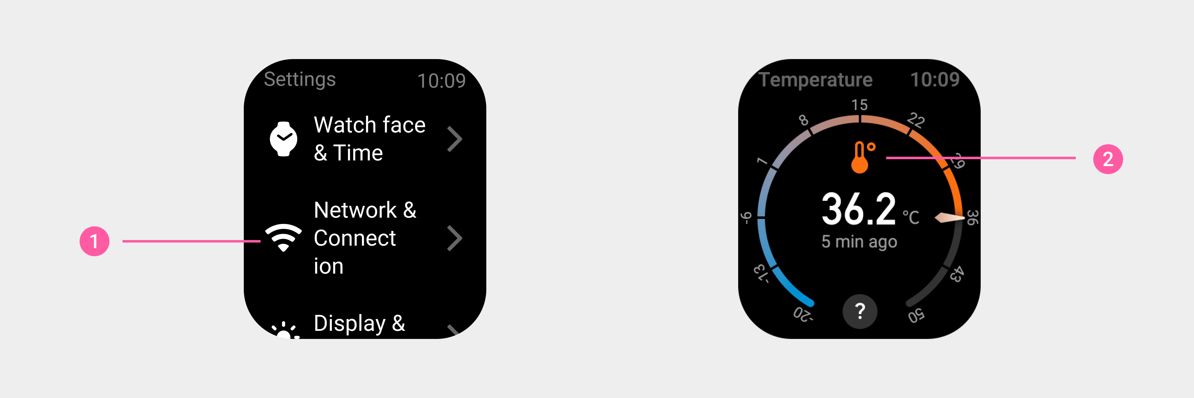
① Settings page: List icon (regular size)
② Temperature page: Thermometer icon (regular size)
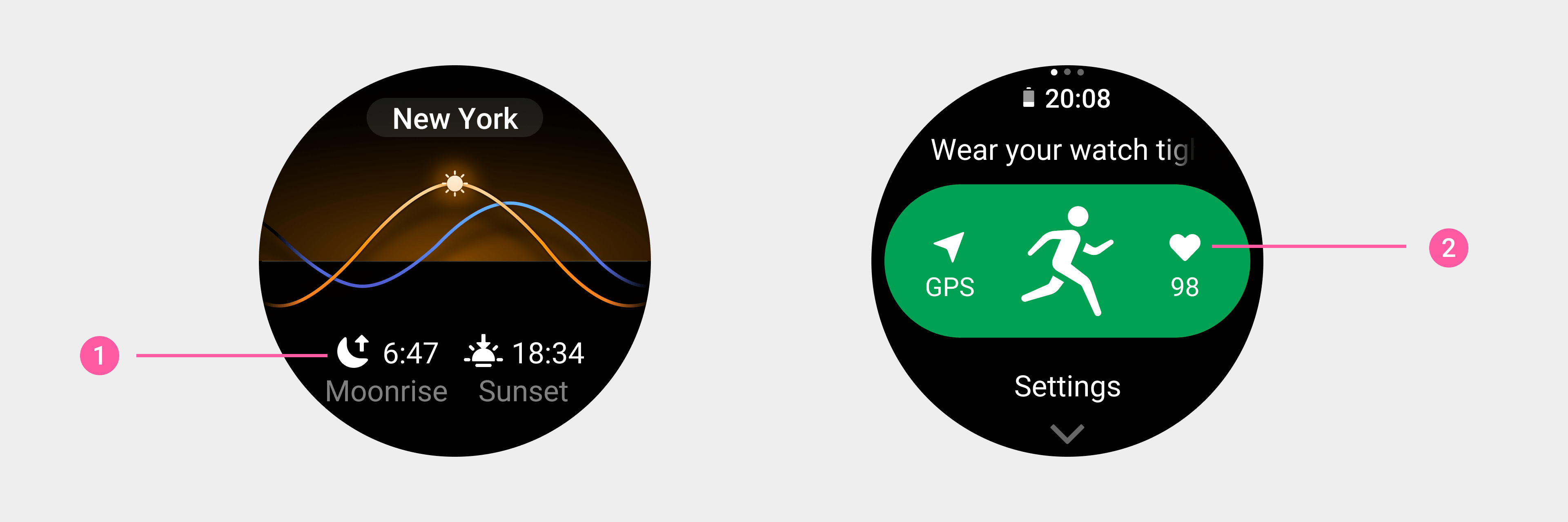
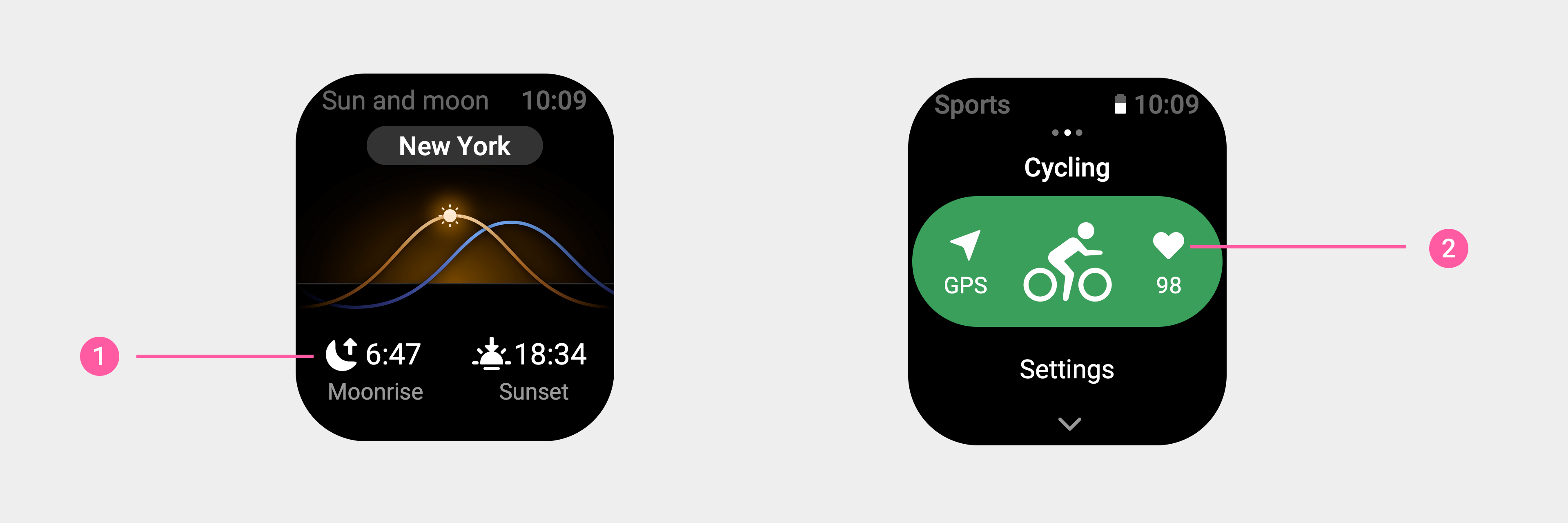
① Sun and moon page: Moonrise/sunset time icons (medium size)
② Pre-workout page: Heart rate icon (medium size)
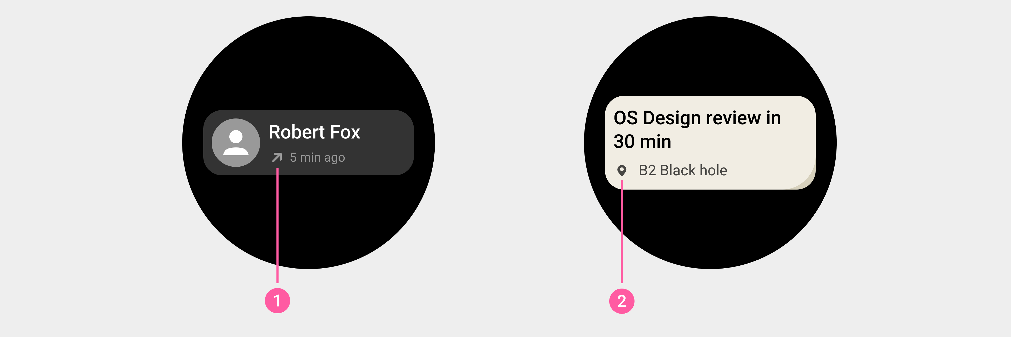
① Call record card: Outgoing call icon (ultra-small size)
② Event reminder card: location icon (ultra-small size)
Icon resource output:
- Size comparison:
| Device resolution | 480×480px | 466×466px | 454×454px | 390×450px |
|---|---|---|---|---|
| Regular size | 64×64px | 63×63px | 61×61px | 64×64px |
| Medium size | 52×52px | 51×51px | 50×50px | 52×52px |
| Ultra-small size | 32×32px | 32×32px | 31×31px | 32×32px |
| Note: The icon needs to contain a blank and transparent safe area (2px on the top, bottom, left, and right). | ||||
- Format: a PNG image surrounded by a blank and transparent area.
Button icons
Button icons are used to represent actions and guidance for a specific operation button. Button icons support regular size, medium size, small size, and ultra-small size.
Usage examples:
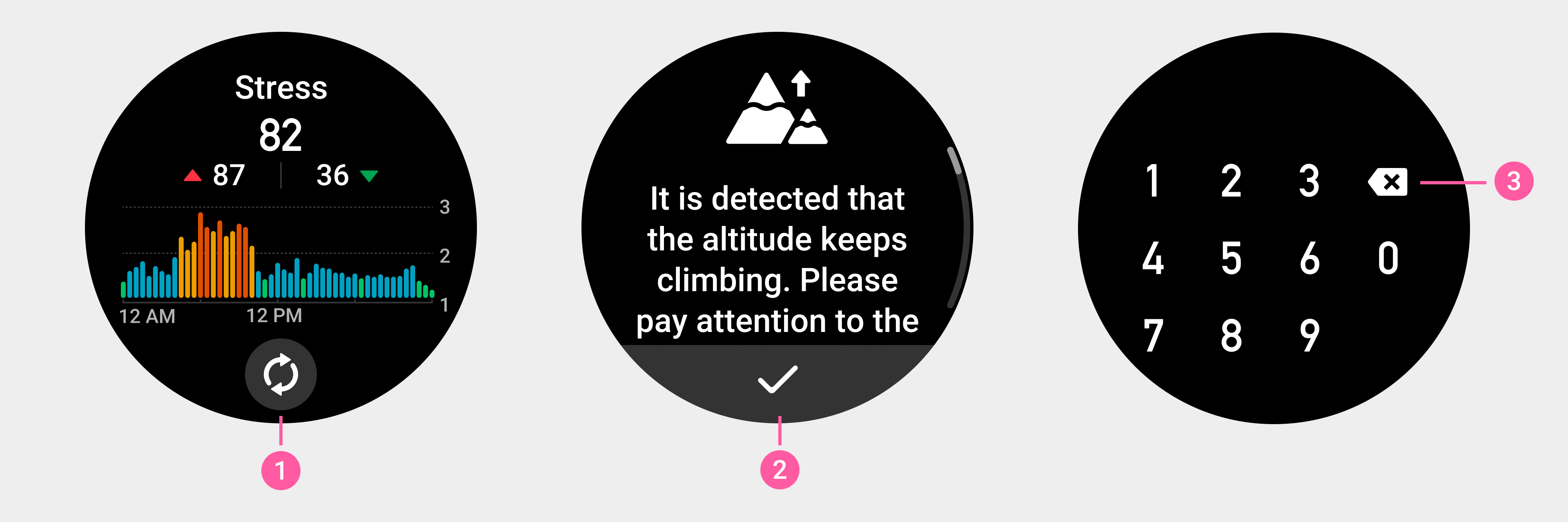
① Refresh button icon (regular size)
② Confirm button icon (regular size)
③ Backspace button icon (regular size)
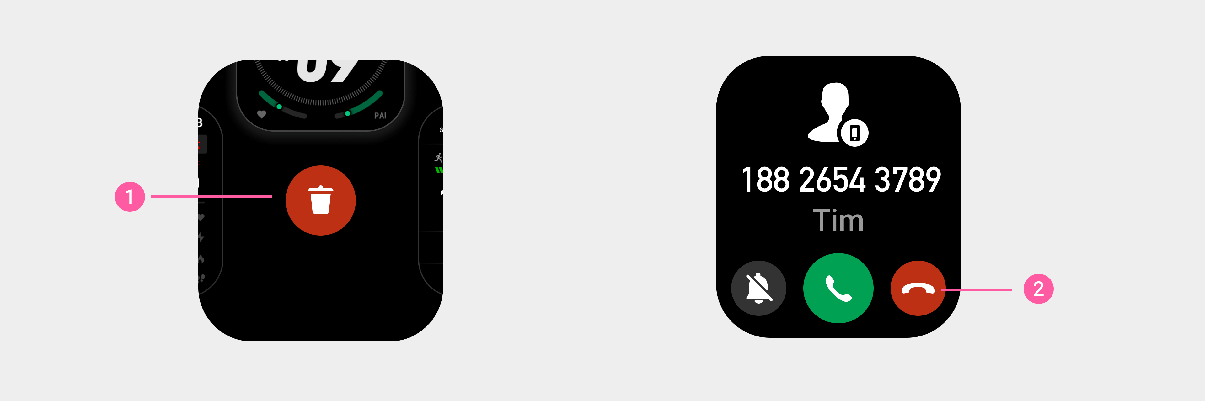
① Delete button icon (regular size)
② Hang Up button icon (regular size)
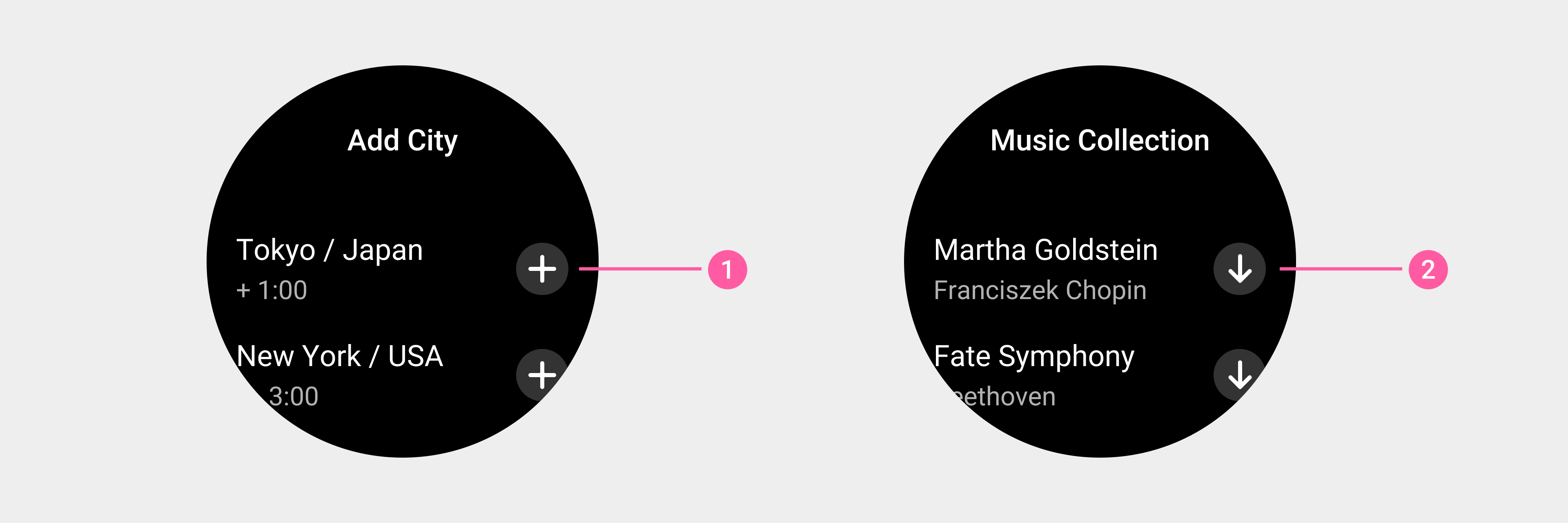
① Add button icon on the right side of a list (medium size)
② Download button (medium size)
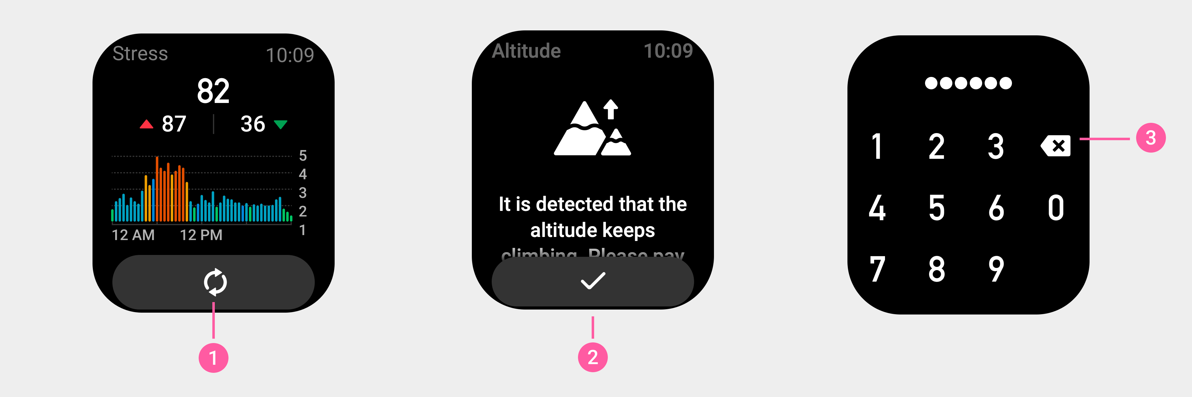
① Refresh button icon (medium size)
② Confirm button icon (medium size)
③ Backspace button icon (medium size)
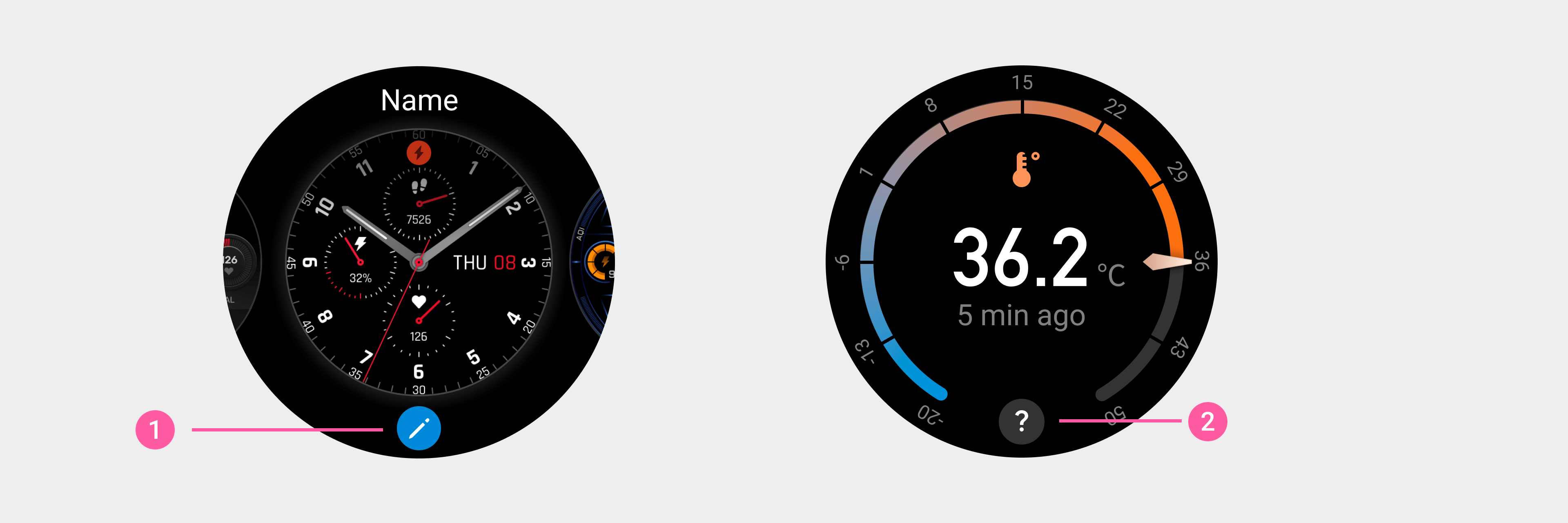
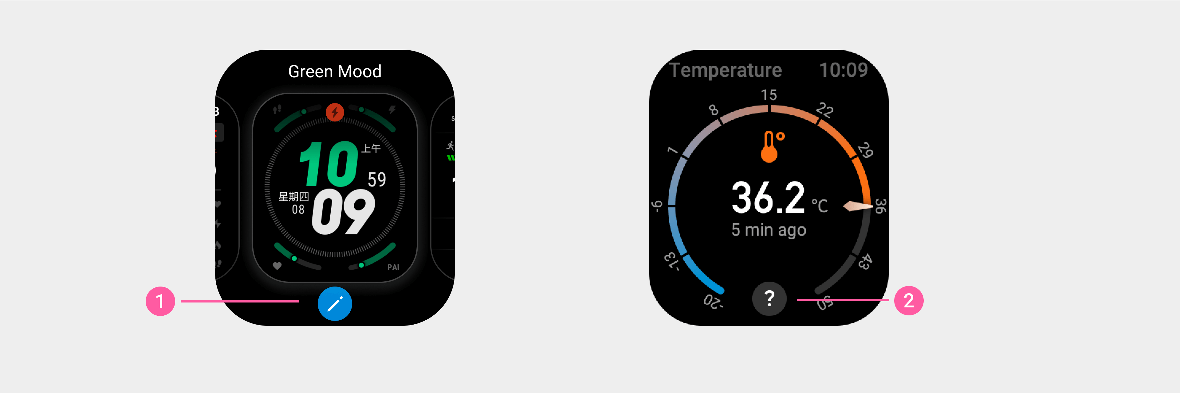
① Watch face edit button icon (small size)
② Explanation button icon at the bottom of a page (small size)


① Explanation button icon after text information (ultra-small size)
Icon resource output:
- Size comparison:
| Device resolution | 480×480px | 466×466px | 454×454px | 390×450px |
|---|---|---|---|---|
| Regular size | 64×64px | 63×63px | 61×61px | 64×64px |
| Medium size | 52×52px | 51×51px | 50×50px | 52×52px |
| Small size | 40×40px | 39×39px | 38×38px | 40×40px |
| Ultra-small size | 32×32px | 32×32px | 31×31px | 32×32px |
| Note: The icon needs to contain a blank and transparent safe area (2px on the top, bottom, left, and right). | ||||
- Format: a PNG image surrounded by a blank and transparent area.