Shortcut Cards
Shortcut Cards are visual containers on the Negative Screen that display core functionalities or important information of an application.
Design Principles
Lightweight and Practical: With shortcuts cards, users can quickly view function information, or perform quick actions through lightweight interactions, It allows users to reach functions directly, reducing the need for navigating through multiple levels.Please distill and display the information or functions that users care most about on the shortcut cards, avoiding too many secondary functions or marketing messages.
Clear at a Glance: The core concept of shortcut cards is to provide users with clear, immediate access to information and facilitate convenient, quick operations. Within the limited space of the card, please arrange text, images, and operational entry points rationally, It allows users to obtain information or complete actions at a glance.
Composition
The components of a shortcut card include the card background, text, actions, and rich media.
Background: By default, use the system color color_sys_item_bg for the background. Custom colors or textures that add additional meaning can also be used.
① Default system color background.
② Meaningful colored backgrounds.
③ Texture backgrounds that incorporate brand-specific colors and graphic information.
Text: Title, subtitle, and descriptive text.

Rich Media: Elements such as charts, graphics, audio playback, etc.
① 带有图表元素的卡片
② 带有图形元素的卡片
③ 音频播放样式的卡片
Actions: Buttons, switches, selectors, and other operable components.
① Card with chart elements
② Card with graphic elements
③ Card styled for audio playback
Visual guidelines
-
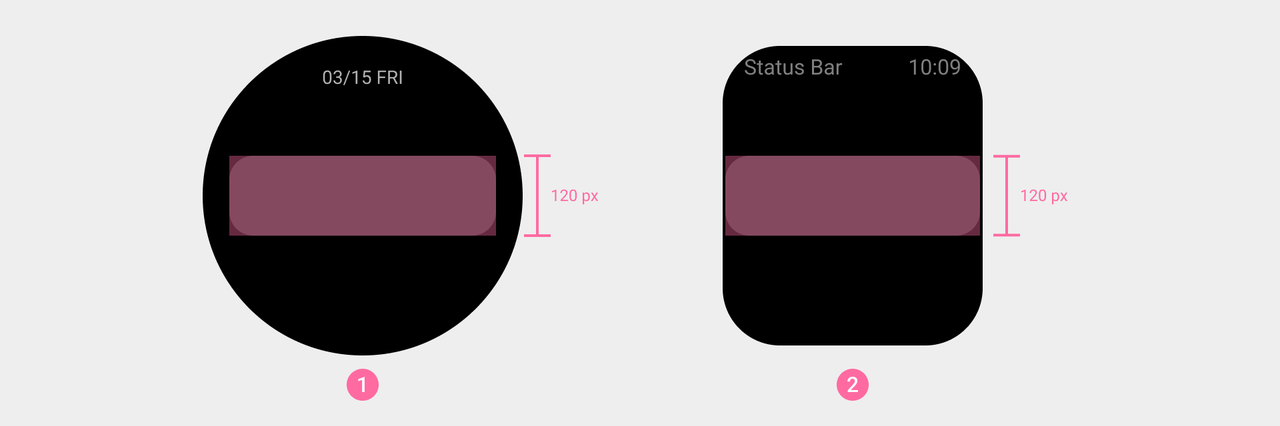
- There is a fixed maximum height for a single card. If the card exceeds this height, the top text will not display completely when the card is at the top of the screen. Additionally, the minimum height for a single card is the height of two lines of text (120 px).
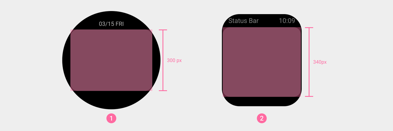
① Maximum card height for round screen devices
② Maximum card height for square screen devices
① Minimum card height for round screen devices
② Minimum card height for square screen devices
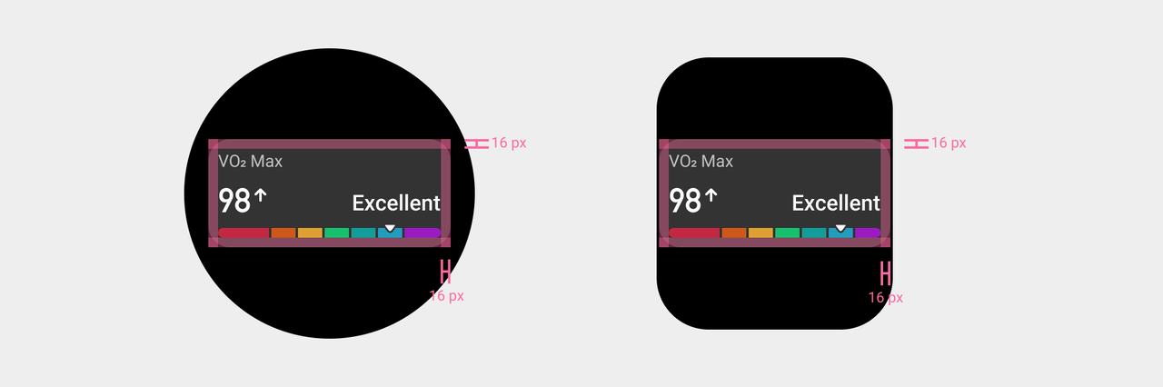
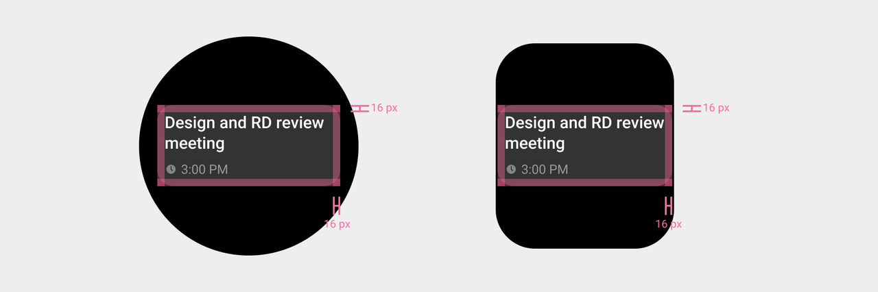
- A safety margin (16px) should be maintained between the card content and the card edges to prevent the content from crowding the edges, which could make the overall appearance look cluttered.
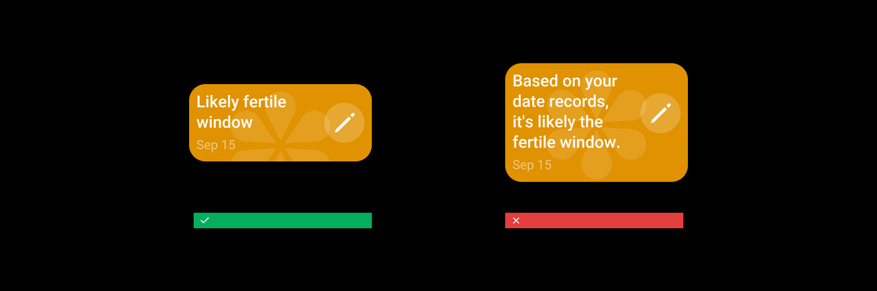
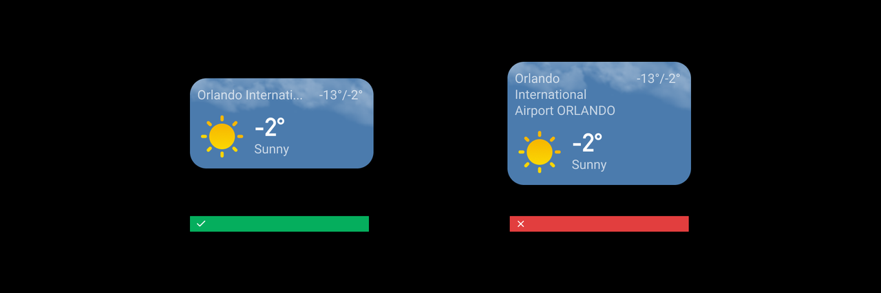
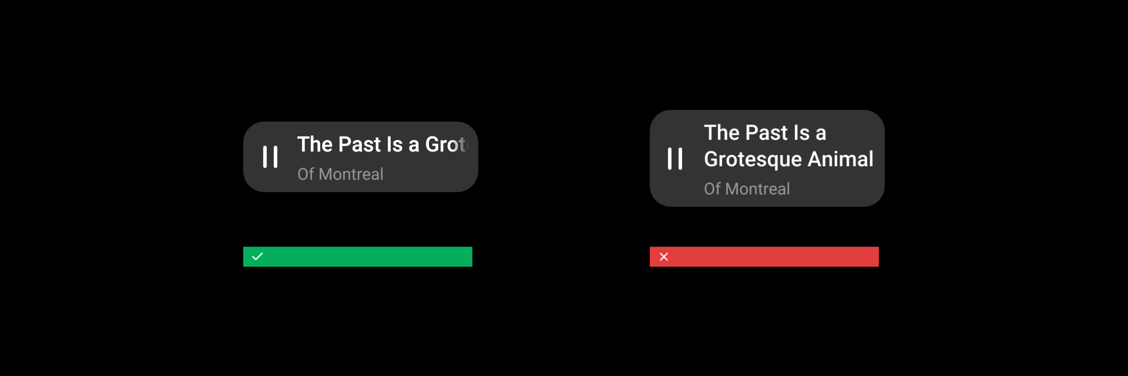
- Due to limited space on the card, focus on the core content when arranging the layout. Use concise and summarized text for titles and content to convey information effectively. For overly long text, prioritize refining and optimizing the copy first. Depending on the specific usage scenario, choose suitable display methods such as showing ellipses or scrolling text. For further details, refer to guidelines Interface layouts
Content layout
We offer a variety of content layout styles to accommodate different information display or functional needs. You can design the layout by referencing corresponding templates based on the content.
- Plain text
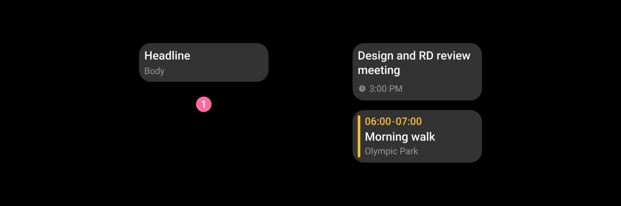
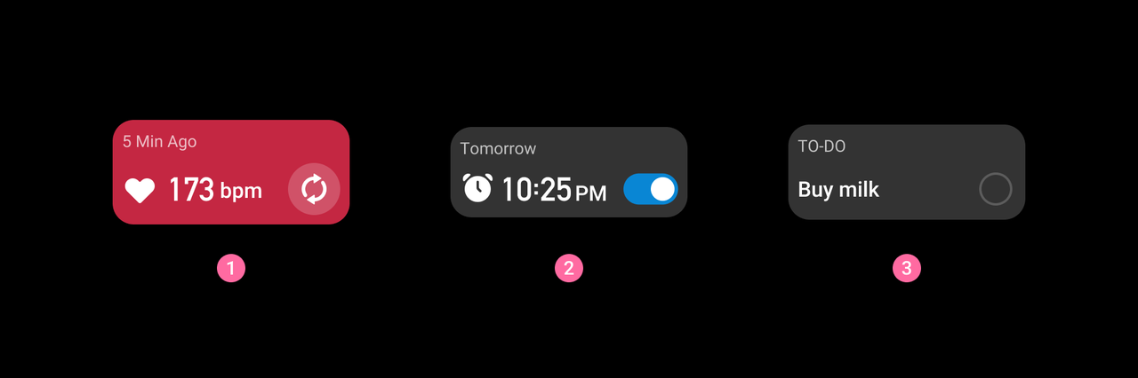
① Title and annotation information, for example: event, To Do.
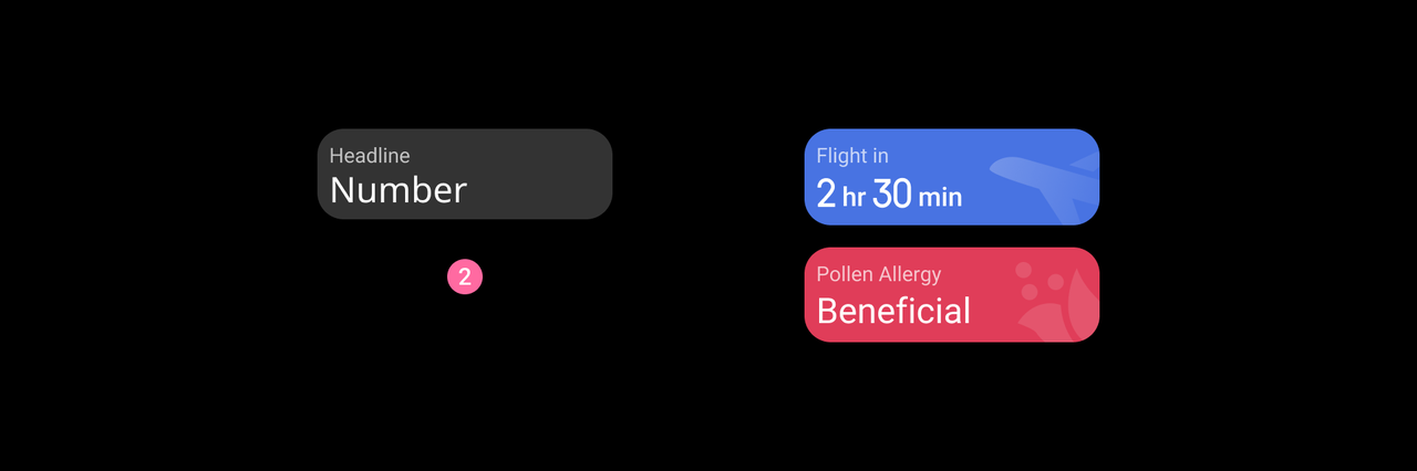
② Title and large numerical information, for example: flight information, pollen allergy index.
- Combinations
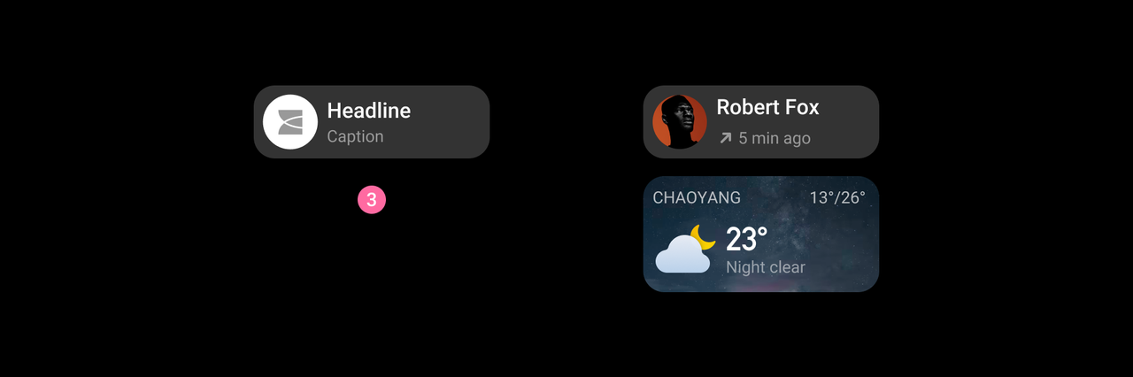
③ Text with icons or images, for example: call logs, weather conditions.
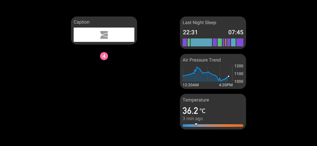
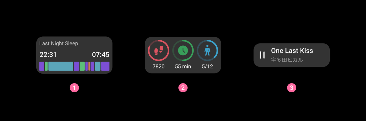
④ Text with charts, for example: last night sleep, air pressure trend, temperature.
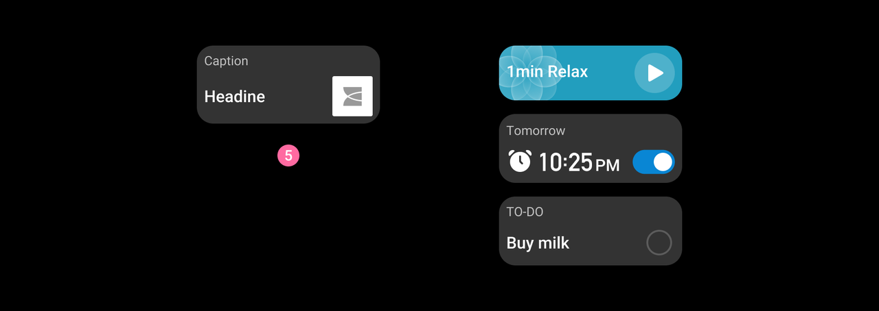
⑤ Text with actionable elements, for example: breathe, alarm, To Do.
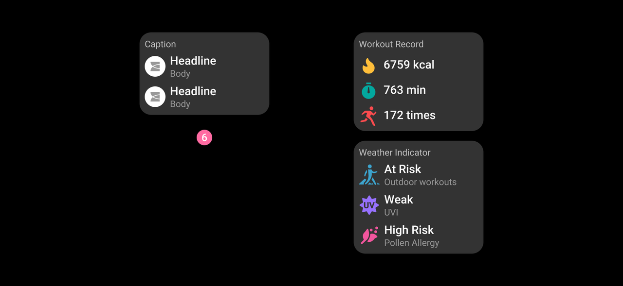
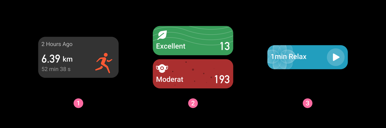
⑥ Vertical layout of Peer information, for example: workout record, weather indicator.
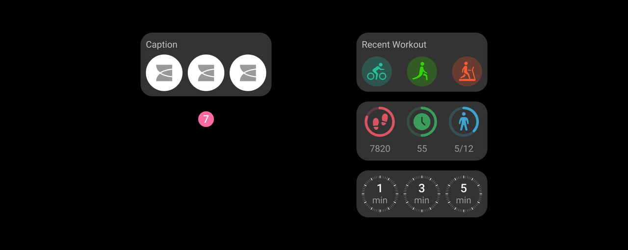
⑦ Horizontal layout of Peer information, for example: recent workout, today's activities, timers.