FAQ about app icon
FAQ
Q1: What are the requirements for the colors of an app icon?
App icons should avoid using pure black or dark backgrounds. Since the system default background is black, a dark background will cause the icon to blend with the system background, thereby reducing the recognizability of the icon. We recommend choosing the app's brand color or other colors that can reflect the app's characteristics.

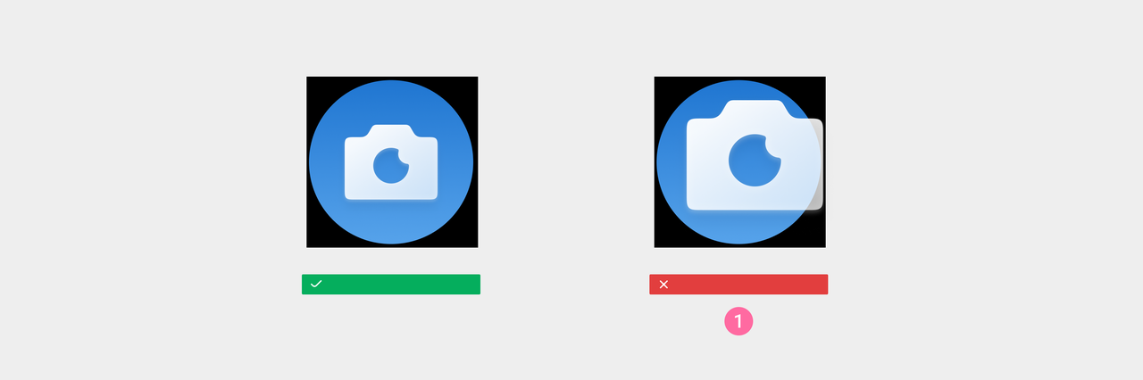
Pure black or near-black backgrounds will merge with the system's default black background, making it indistinguishable, as shown in the image above. This will cause your app icon to lose its circular background contour, reducing the recognizability of the icon.

Correct design example
The background image should not contain transparent areas, which affect the visual impact and recognizability of the icon.

Icons should not have transparency, ensuring that the background color does not show through the icon, to maintain the clarity and distinguishability of the icon.

Q2: Can the shape of the app icon be freely designed?
The overall shape of the app icon should be a perfect circle, to avoid creating a visually irregular look that disrupts the uniformity of the system.
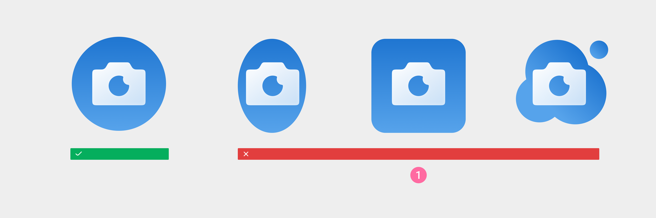
① Do not use non-circular background images
The main graphic of an app list icon should not exceed the background image area.This helps maintain the overall integrity and visual uniformity of the icon.
① Do not let the main content size exceed the backing plate area.
Q3: What sizes do Icon applications need to output?
Icon used in the system
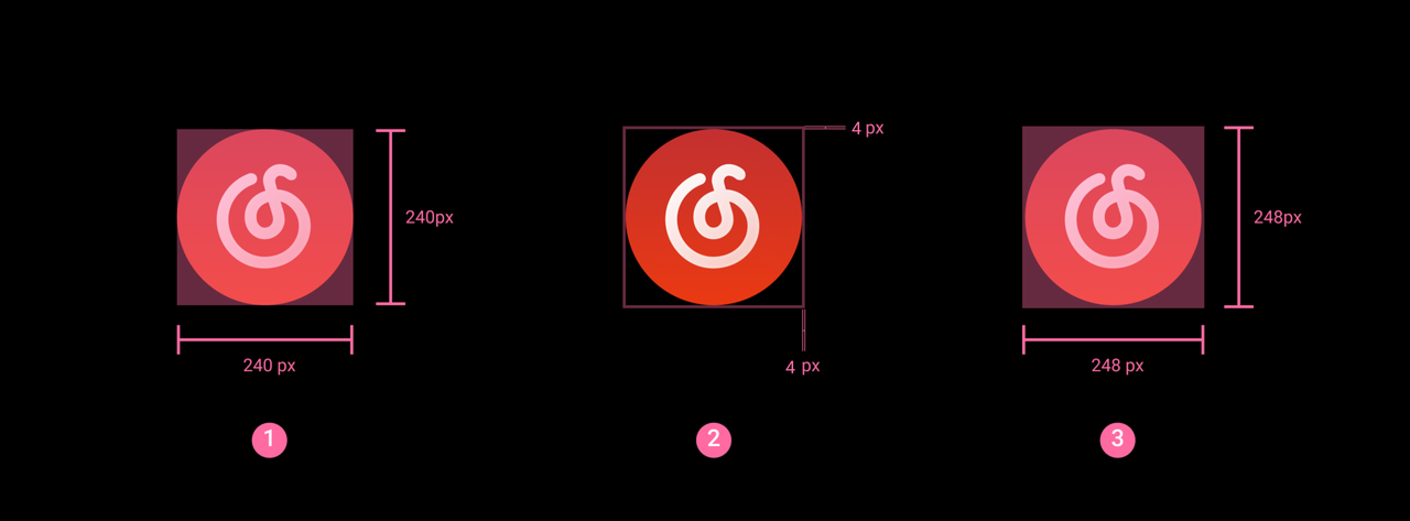
① Icon content size is 240×240px
② A 4px transparent safety zone around all four sides
③ The final size of the application icon should be 248×248px
Actual use example
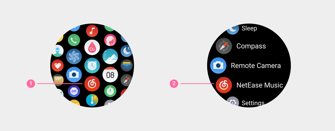
① The application icon for "NetEase Music" in the enhanced grid view
② The application icon of "NetEase Music" in the list view
app icon for app store
The icon here is only used to upload in the Console and display in the app store.
- Icon size: 240 * 240px, image format: PNG
- The icon should be a circular image with transparent background, keep the area around the image transparent and not filled with color or any other things.
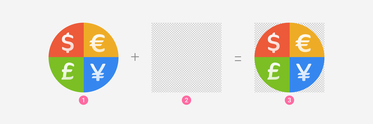
① Application icon
② 240×240 px square transparent background
③ Application icon: place the App icon image in the middle of the square transparent background,make sure there are no margins around the icon
Actual use example
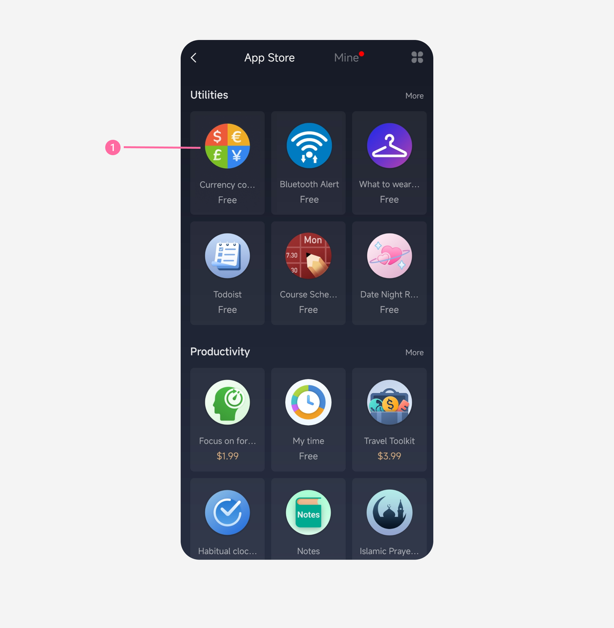
① The Currency converter app icon in the app store
Design Specifications
Please refer to Icon Design Specification for detailed design specifications.